约束布局 ConstraintLayout 是一个 ViewGroup,以 support 包的方式来提供兼容版本的使用方式,可以在 Api9(android 2.3) 以上的 Android 系统使用它,它的出现主要是为了解决布局嵌套过多的问题,以灵活的方式定位和调整小部件。从 Android Studio 2.3 起,官方的模板默认使用 ConstraintLayout。
ConstraintLayout (opens new window) 可让您使用扁平视图层次结构(无嵌套视图组)创建复杂的大型布局。它与 RelativeLayout (opens new window) 相似,其中所有的视图均根据同级视图与父布局之间的关系进行布局,但其灵活性要高于 RelativeLayout,并且更易于与 Android Studio 的布局编辑器配合使用。
ConstraintLayout 的所有功能均可直接通过 Android Studio 的布局编辑器的可视化工具来使用,因为布局 API 和布局编辑器是专为彼此构建的,因此,您完全可以通过拖放的形式(而非修改 XML)来构建布局。当然作为一名程序猿来说,可视化带来方便的同时也可能会带来一些不可控的因素或者冗余的布局元素,所以日常布局中还是建议自己通过代码精确的布局,方便理解和更细腻的元素控制。
# 约束布局的优势
在开发过程中经常能遇到一些复杂的UI,可能会出现布局嵌套过多的问题,嵌套得越多,设备绘制视图所需的时间和计算功耗也就越多。
ConstraintLayout 使用起来比 RelativeLayout 更灵活,性能更出色,最重要的是 ConstraintLayout 可以按照比例约束控件位置和尺寸,能够更好地适配屏幕大小不同的机型。
# 添加开发依赖
如需在项目中使用 ConstraintLayout,请按以下步骤操作:
- 确保您的
maven.google.com代码库已在项目级的build.gradle文件中声明:
    repositories {
        google()
    }
- 将该库作为依赖项添加到模块级的
build.gradle文件中,如以下示例所示。请注意,最新版本可能与示例中显示的不同:
dependencies {
    implementation "androidx.constraintlayout:constraintlayout:2.0.4"
    // To use constraintlayout in compose
    implementation "androidx.constraintlayout:constraintlayout-compose:1.0.0-alpha06"
}
- 在工具栏或同步通知中,点击 Sync Project with Gradle Files。
现在,您可以在项目工程模块中使用 ConstraintLayout 来构建布局了。
# 约束条件说明
要在 ConstraintLayout 中定义某个视图的位置,您必须为该视图添加至少一个水平约束条件和一个垂直约束条件。每个约束条件均表示与其他视图、父布局或隐形引导线之间连接或对齐方式。每个约束条件均定义了视图在竖轴或者横轴上的位置;因此每个视图在每个轴上都必须至少有一个约束条件,但通常情况下会需要更多约束条件。
# 使用约束布局
# 相对定位
相对定位是在 ConstraintLayout 中基本约束构建布局的方式之一,约束允许一个部件相对位置相对于另一个部件相对位置进行定位。
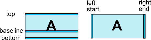
水平轴:left, right, start, end
垂直轴:top, bottom, baseline(text 文本属性)
相对定位的约束示意图:
常见的相对定位属性:
layout_constraintLeft_toLeftOflayout_constraintLeft_toRightOflayout_constraintRight_toLeftOflayout_constraintRight_toRightOflayout_constraintTop_toTopOflayout_constraintTop_toBottomOflayout_constraintBottom_toTopOflayout_constraintBottom_toBottomOflayout_constraintBaseline_toBaselineOflayout_constraintStart_toEndOflayout_constraintStart_toStartOflayout_constraintEnd_toStartOflayout_constraintEnd_toEndOf
它们都带一个引用 id 到另一个参考约束的部件,或者父部件(它将引用父容器,即ConstraintLayout),如果约束参考的是父容器的话,指定参考对象为:parent 即可。
可以简单理解是将部件的指定的位置侧约束到任何其他部件的一个位置侧。
示例1:相对父布局居中:
    <Button
        android:layout_width="wrap_content"
        android:layout_height="wrap_content"
        app:layout_constraintLeft_toLeftOf="parent"
        app:layout_constraintTop_toTopOf="parent"
        app:layout_constraintRight_toRightOf="parent"
        app:layout_constraintBottom_toBottomOf="parent"/>
示例2:组件B的左侧约束在组件A的右侧:
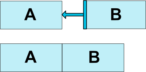
xml布局方式为:
<Button
    android:id="@+id/btn_a" ... />

<!-- 按钮B的左侧被约束到按钮A的右侧 -->
<Button
    android:id="@+id/btn_b" ...
    app:layout_constraintLeft_toRightOf="@+id/btn_a" />
示例3:不同高度的文本组件对齐:
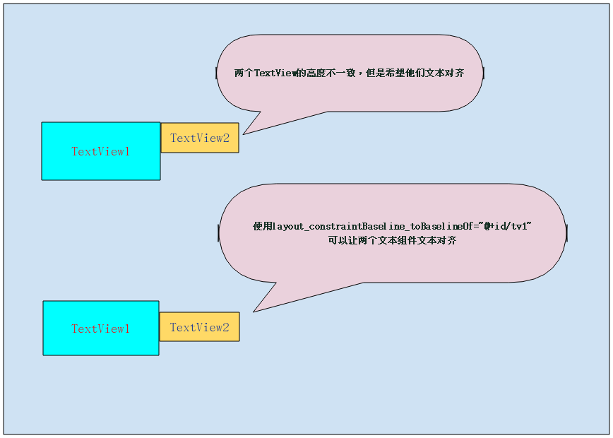
xml布局方式为:
<TextView
    android:id="@+id/tv1"
    .../>

<TextView
    android:id="@+id/tv2"
    app:layout_constraintLeft_toRightOf="@+id/tv1"
    app:layout_constraintBaseline_toBaselineOf="@+id/tv1"
    .../>
# 设置边距
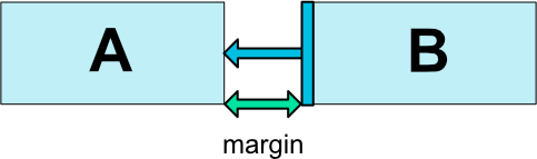
可以通过设置边距(margin),将应用于组件的相应方向的边距约束,强制将边距作为目标和源端之间的空间。
布局边距属性(不同的方向):
android:layout_marginStartandroid:layout_marginEndandroid:layout_marginLeftandroid:layout_marginTopandroid:layout_marginRightandroid:layout_marginBottom
注意:
控件必须在布局里约束一个相对位置,边距只能大于或等于零,并取对应的尺寸单位参数。
示例:
xml布局:
<?xml version="1.0" encoding="utf-8"?>
<androidx.constraintlayout.widget.ConstraintLayout xmlns:android="http://schemas.android.com/apk/res/android"
    xmlns:app="http://schemas.android.com/apk/res-auto"
    android:layout_width="match_parent"
    android:layout_height="match_parent">

    <Button
        android:layout_width="wrap_content"
        android:layout_height="wrap_content"
        android:layout_marginLeft="50dp"
        android:layout_marginTop="50dp"
        android:text="Button1"
        app:layout_constraintLeft_toLeftOf="parent"
        app:layout_constraintTop_toTopOf="parent" />

</androidx.constraintlayout.widget.ConstraintLayout>
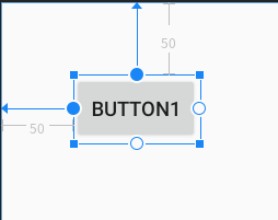
效果:按钮组件确定了相对约束(左,右方向参考父布局)的位置后,此时设置按钮的左边距为 50dp 距离,顶部边距为 50dp 。
如果组件参考的目标 visibility 设置了 View.GONE (不可见)属性,这时可以设置 goneMargin 属性来设置参考目标不可见时的边距。
goneMargin 不同方向的边距属性:
layout_goneMarginStartlayout_goneMarginEndlayout_goneMarginLeftlayout_goneMarginToplayout_goneMarginRightlayout_goneMarginBottom
示例:
xml布局:
<?xml version="1.0" encoding="utf-8"?>
<androidx.constraintlayout.widget.ConstraintLayout xmlns:android="http://schemas.android.com/apk/res/android"
    xmlns:app="http://schemas.android.com/apk/res-auto"
    android:layout_width="match_parent"
    android:layout_height="match_parent">

    <Button
        android:id="@+id/btn1"
        android:layout_width="wrap_content"
        android:layout_height="wrap_content"
        android:text="Button1"
        android:visibility="gone"
        app:layout_constraintLeft_toLeftOf="parent"
        app:layout_constraintTop_toTopOf="parent" />

    <Button
        android:id="@+id/btn2"
        android:layout_width="wrap_content"
        android:layout_height="wrap_content"
        android:text="Button2"
        app:layout_constraintLeft_toRightOf="@id/btn1"
        app:layout_constraintTop_toTopOf="parent"
        app:layout_goneMarginLeft="100dp" />

</androidx.constraintlayout.widget.ConstraintLayout>
效果:
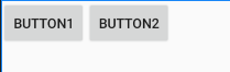
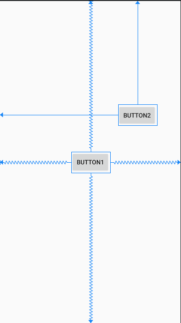
当 Button1 组件的 visibility="visible" 时,Button2 组件的左边距为 0。
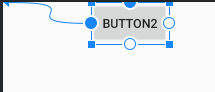
当 Button1 组件的 visibility="gone" 时,Button2 组件的左边距为 100dp。
# 居中和偏移
# 1. 居中
约束布局中将控件居中的方法:通过在水平或者垂直的方向上参考目标设置为 parent且添加方向相反的约束来完成水平或垂直方向的居中效果。
水平居中:
layout_constraintLeft_toLeftOf="parent"
layout_constraintRight_toRightOf="parent"
垂直居中:
layout_constraintTop_toTopOf="parent"
layout_constraintBottom_toBottomOf="parent"
水平和垂直居中(布局内居中):
layout_constraintLeft_toLeftOf="parent"
layout_constraintTop_toTopOf="parent"
layout_constraintRight_toRightOf="parent"
layout_constraintBottom_toBottomOf="parent"
示例:
xml布局:
<?xml version="1.0" encoding="utf-8"?>
<androidx.constraintlayout.widget.ConstraintLayout xmlns:android="http://schemas.android.com/apk/res/android"
xmlns:app="http://schemas.android.com/apk/res-auto"
android:layout_width="match_parent"
android:layout_height="match_parent">
<!-- 水平方向:left,right 约束居中 -->
<Button
android:id="@+id/btn1"
android:layout_width="wrap_content"
android:layout_height="wrap_content"
android:text="Button1"
app:layout_constraintLeft_toLeftOf="parent"
app:layout_constraintRight_toRightOf="parent"
app:layout_constraintTop_toTopOf="parent" />
<!-- 垂直方向:top,bottom 约束居中 -->
<Button
android:id="@+id/btn2"
android:layout_width="wrap_content"
android:layout_height="wrap_content"
android:text="Button2"
app:layout_constraintBottom_toBottomOf="parent"
app:layout_constraintLeft_toLeftOf="parent"
app:layout_constraintTop_toTopOf="parent" />
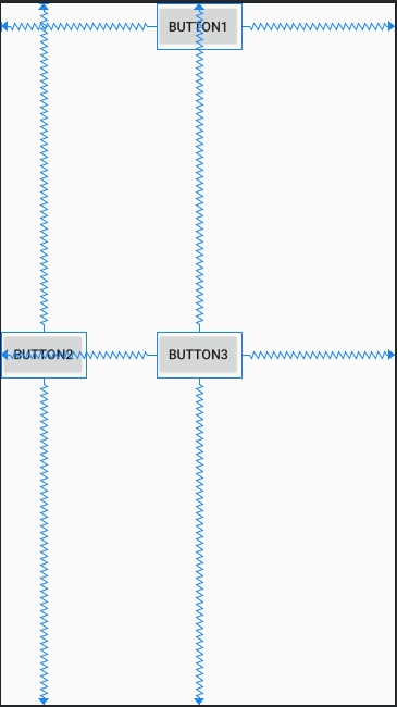
<!-- 整体布局内居中:left,right,top,bottom 水平和垂直方向约束居中 -->
<Button
android:id="@+id/btn3"
android:layout_width="wrap_content"
android:layout_height="wrap_content"
android:text="Button3"
app:layout_constraintBottom_toBottomOf="parent"
app:layout_constraintLeft_toLeftOf="parent"
app:layout_constraintRight_toRightOf="parent"
app:layout_constraintTop_toTopOf="parent" />
</androidx.constraintlayout.widget.ConstraintLayout>
效果:
# 2. 偏移
约束布局中的同方向上遇到相反的约束时,默认是将小部件居中,但是您可以使用偏移(Bias)属性调整位置,使其偏向一方。
偏移的属性:
layout_constraintHorizontal_bias:水平方向偏移量,范围 0.0~1.0(0~100%)。layout_constraintVertical_bias:垂直方向偏移量,范围 0.0~1.0(0~100%)。
示例:
xml布局:
<?xml version="1.0" encoding="utf-8"?>
<androidx.constraintlayout.widget.ConstraintLayout xmlns:android="http://schemas.android.com/apk/res/android"
    xmlns:app="http://schemas.android.com/apk/res-auto"
    android:layout_width="match_parent"
    android:layout_height="match_parent">

    <!--水平居中,水平方向上偏移20% -->
    <Button
        android:layout_width="wrap_content"
        android:layout_height="wrap_content"
        android:text="Button1"
        app:layout_constraintHorizontal_bias="0.2"
        app:layout_constraintLeft_toLeftOf="parent"
        app:layout_constraintRight_toRightOf="parent"
        app:layout_constraintTop_toTopOf="parent" />

    <!--垂直居中,垂直方向上偏移80% -->
    <Button
        android:layout_width="wrap_content"
        android:layout_height="wrap_content"
        android:text="Button2"
        app:layout_constraintBottom_toBottomOf="parent"
        app:layout_constraintLeft_toLeftOf="parent"
        app:layout_constraintTop_toTopOf="parent"
        app:layout_constraintVertical_bias="0.8" />
</androidx.constraintlayout.widget.ConstraintLayout>
效果:Button1 水平居中后在水平方向偏移20%,Button2 垂直居中后在垂直方向偏移80% 。
# 角度定位
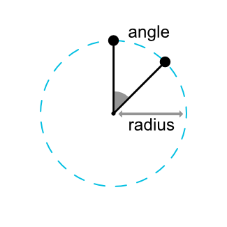
1.1 版本中新增的功能,以一定的角度和距离约束一个部件中心相对于另一个部件中心进行布局定位。
角度定位的属性:
layout_constraintCircle: 参考的组件的id。layout_constraintCircleRadius: 到参考部件中心的距离。layout_constraintCircleAngle: 部件应该处于哪个角度(取值范围: 0 ~ 360 )。
示例:
xml布局:
<?xml version="1.0" encoding="utf-8"?>
<androidx.constraintlayout.widget.ConstraintLayout xmlns:android="http://schemas.android.com/apk/res/android"
    xmlns:app="http://schemas.android.com/apk/res-auto"
    android:layout_width="match_parent"
    android:layout_height="match_parent">

    <!-- 被参考的组件 -->
    <Button
        android:id="@+id/btn1"
        android:layout_width="wrap_content"
        android:layout_height="wrap_content"
        android:text="Button1"
        app:layout_constraintBottom_toBottomOf="parent"
        app:layout_constraintLeft_toLeftOf="parent"
        app:layout_constraintRight_toRightOf="parent"
        app:layout_constraintTop_toTopOf="parent" />

    <!-- 参考btn1组件, 角度45°,距离150dp -->
    <Button
        android:id="@+id/btn2"
        android:layout_width="wrap_content"
        android:layout_height="wrap_content"
        android:text="Button2"
        app:layout_constraintCircle="@id/btn1"
        app:layout_constraintCircleAngle="45"
        app:layout_constraintCircleRadius="150dp"
        app:layout_constraintLeft_toLeftOf="parent"
        app:layout_constraintTop_toTopOf="parent" />
</androidx.constraintlayout.widget.ConstraintLayout>
效果:
# 可见行为
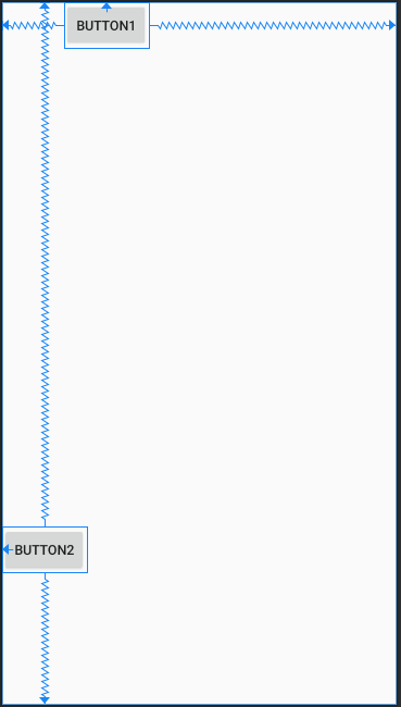
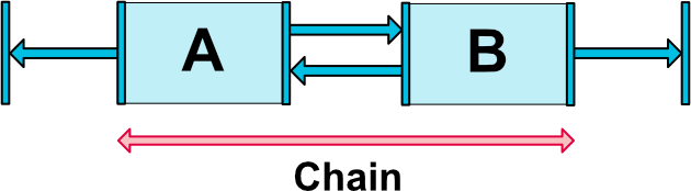
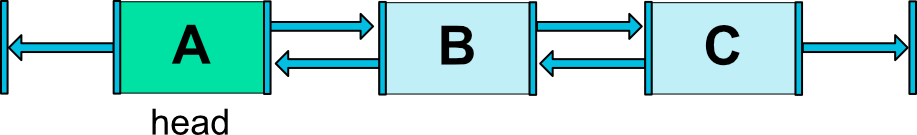
ConstraintLayout 对于标记可见性为 View.GONE 的组件有特殊的处理。通常情况下被标记可见性为 View.GONE 的组件,其表现为不显示,也不是布局本身的一部分。但是 ConstraintLayout 中会将其认为是一个尺寸大小为 0 的组件,如果与其他组件存在约束行为的话,在不可见时仍然后有效。
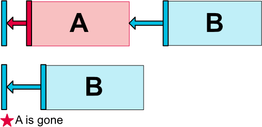
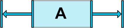
如上面示意图所示:
A 有一个50dp边距到其容器的一侧,B 只有100dp到 A,当标记 A 消失,B 将具有100dp的边距到容器。因此,您可以指定连接到窗口小部件已被标记为消失的窗口小部件,如
goneMarginXXX属性可以指定在 A 消失时的边距大小。
# 尺寸约束
可以通过四种不同方式指定组件的尺寸,有具体的尺寸大小,WRAP_CONTENT,MATCH_CONSTRAINT(0dp),宽高比等方式实现。
# 1. 使用指定的尺寸
可以指定组件的 android:layout_width 和 android:layout_height 属性来指定具体的组件大小。
例如: 指定组件的宽度为100dp大小,高度为80dp大小。
android:layout_width="100dp"
android:layout_height="80dp"
# 2. 使用WRAP_CONTENT
当控件的高度或宽度为wrap_content时,让控件自己计算大小,可以使用下列属性来控制最大、最小的高度或宽度:
android:minWidth: 最小的宽度android:minHeight: 最小的高度android:maxWidth: 最大的宽度android:maxHeight: 最大的高度
注意: 当ConstraintLayout为1.1版本以下时,使用这些属性需要加上强制约束,如下所示:
app:layout_constrainedWidth="true|false"app:layout_constrainedHeight="true|false"
# 3. 使用MATCH_CONSTRAINT
当维度设置为match_constraint(尺寸为0dp)时,默认行为是使结果大小取所有空间。
提供了几种额外的修饰符:
layout_constraintWidth_min: 设置最小宽度约束layout_constraintHeight_min: 设置最小高度约束layout_constraintWidth_max: 设置最大宽度约束layout_constraintHeight_max: 设置最大高度约束layout_constraintWidth_percent: 设置宽度的占用比例,取值:0.0 ~ 1.0layout_constraintHeight_percent: 设置高度的占用比例,取值:0.0 ~ 1.0
注意: 如果需要使用占用比例(percent),需要进行以下设置:
- 尺寸应设置为
match_constraint(0dp) - 默认值应设置为:
app:layout_constraintWidth_default="percent"或app:layout_constraintHeight_default="percent" - 然后将
layout_constraintwidth_percent或layout_constraintheight_percent属性设置为0到1之间的值
官方不推荐在 ConstraintLayout 中使用 match_parent,可以设置 0dp (MATCH_CONSTRAINT) 配合约束代替 match_parent 。
WRAP_CONTENT 和 MATCH_CONSTRAINT(0dp)是 ConstraintLayout 1.1 版本中新增的。
# 4. 使用宽高比
您还可以将部件的一个维度(宽度或者高度)定义为另一个的比例,但是,需要将至少一个受约束的维度设置为0dp(即,match_constraint),并将属性layout_constraintDimensionRatio设置为给定的比率。
比率的表示方式有两种:
- float 类型的数值,其含义表示为
“宽:高”的比率数值。 - "width:height" 表达式,表示
“宽:高”的比率。
示例:
xml布局:
<?xml version="1.0" encoding="utf-8"?>
<androidx.constraintlayout.widget.ConstraintLayout xmlns:android="http://schemas.android.com/apk/res/android"
xmlns:app="http://schemas.android.com/apk/res-auto"
android:layout_width="match_parent"
android:layout_height="match_parent"
android:background="#787373">
<!-- 指定高度值,宽高比率约束为:1:3 -->
<ImageView
android:layout_width="0dp"
android:layout_height="200dp"
app:layout_constraintDimensionRatio="1:3"
android:background="#2196F3"
app:layout_constraintLeft_toLeftOf="parent"
app:layout_constraintRight_toRightOf="parent"
app:layout_constraintTop_toTopOf="parent" />
<!-- 自适应高度,宽度充满最大约束,宽高比率约束为:1:1 -->
<Button
android:layout_width="0dp"
android:layout_height="wrap_content"
app:layout_constraintDimensionRatio="1:1"
android:text="1:1"
app:layout_constraintBottom_toBottomOf="parent"
app:layout_constraintLeft_toLeftOf="parent"
app:layout_constraintRight_toRightOf="parent"
app:layout_constraintTop_toTopOf="parent" />
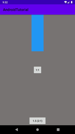
<!-- 使用float数值来表示宽高比率为:1.5(2:1) -->
<Button
android:layout_width="0dp"
android:layout_height="wrap_content"
app:layout_constraintDimensionRatio="2.0"
android:text="1.5 (2:1)"
app:layout_constraintLeft_toLeftOf="parent"
app:layout_constraintRight_toRightOf="parent"
app:layout_constraintBottom_toBottomOf="parent" />
</androidx.constraintlayout.widget.ConstraintLayout>
效果:
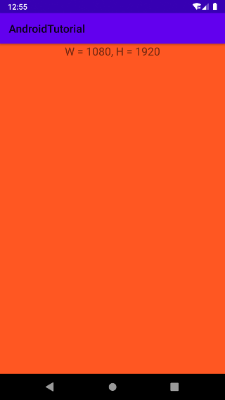
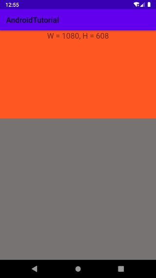
如果两个尺寸设置为 Match_Constraint(0dp),在一个维度方向上有相反的约束,则可以使用最大填充的比率。在这种情况下,系统设置满足宽度的最大维度,并维护指定的宽高比。为了基于另一个特定的侧面来限制一个特定侧,您可以通过添加字母W(用于约束宽度)或H(用于约束高度),指示约束分母是宽或者高,由逗号分隔:
1. 指定 W 约束分母,此时 16:9 = 高:宽
app:layout_constraintDimensionRatio="W,16:9"

2. 指定 H 约束分母,此时 16:9 = 宽:高
app:layout_constraintDimensionRatio="H,16:9"
示例:
xml布局:
- 指定 W,16:9 约束布局
<?xml version="1.0" encoding="utf-8"?>
<androidx.constraintlayout.widget.ConstraintLayout xmlns:android="http://schemas.android.com/apk/res/android"
    xmlns:app="http://schemas.android.com/apk/res-auto"
    android:layout_width="match_parent"
    android:layout_height="match_parent"
    android:background="#787373">

    <TextView
        android:id="@+id/tv"
        android:layout_width="0dp"
        android:layout_height="0dp"
        app:layout_constraintDimensionRatio="W,16:9"
        android:background="#FF5722"
        android:gravity="top|center_horizontal"
        android:textSize="20sp"
        app:layout_constraintTop_toTopOf="parent"
        app:layout_constraintLeft_toLeftOf="parent"
        app:layout_constraintRight_toRightOf="parent"/>

</androidx.constraintlayout.widget.ConstraintLayout>
- 指定 H,16:9 约束布局
<?xml version="1.0" encoding="utf-8"?>
<androidx.constraintlayout.widget.ConstraintLayout xmlns:android="http://schemas.android.com/apk/res/android"
    xmlns:app="http://schemas.android.com/apk/res-auto"
    android:layout_width="match_parent"
    android:layout_height="match_parent"
    android:background="#787373">

    <TextView
        android:id="@+id/tv"
        android:layout_width="0dp"
        android:layout_height="0dp"
        app:layout_constraintDimensionRatio="H,16:9"
        android:background="#FF5722"
        android:gravity="top|center_horizontal"
        android:textSize="20sp"
        app:layout_constraintTop_toTopOf="parent"
        app:layout_constraintLeft_toLeftOf="parent"
        app:layout_constraintRight_toRightOf="parent"/>

</androidx.constraintlayout.widget.ConstraintLayout>
效果:
- 指定 W,16:9 约束效果:
- 指定 H,16:9 约束效果:
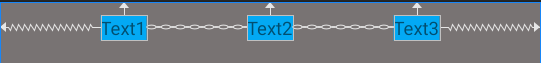
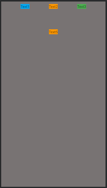
# 链式布局
链是一组视图,这些视图通过双向位置约束条件相互链接到一起,链中的视图可以垂直或水平分布。
# 1. 创建一个链布局
两个或以上控件通过在单个轴上(水平或垂直)的方式约束在一起,另一个轴可以单独约束,就可以认为是他们是一条链。
示例:
xml布局:
<?xml version="1.0" encoding="utf-8"?>
<androidx.constraintlayout.widget.ConstraintLayout xmlns:android="http://schemas.android.com/apk/res/android"
    xmlns:app="http://schemas.android.com/apk/res-auto"
    android:layout_width="match_parent"
    android:layout_height="match_parent"
    android:background="#787373"
    android:paddingTop="10dp">

    <TextView
        android:id="@+id/tv1"
        android:layout_width="wrap_content"
        android:layout_height="wrap_content"
        android:text="Text1"
        android:background="#03A9F4"
        app:layout_constraintTop_toTopOf="parent"
        app:layout_constraintLeft_toLeftOf="parent"
        app:layout_constraintRight_toLeftOf="@+id/tv2" />

    <TextView
        android:id="@+id/tv2"
        android:layout_width="wrap_content"
        android:layout_height="wrap_content"
        android:text="Text2"
        android:background="#03A9F4"
        app:layout_constraintTop_toTopOf="parent"
        app:layout_constraintLeft_toRightOf="@+id/tv1"
        app:layout_constraintRight_toLeftOf="@+id/tv3" />

    <TextView
        android:id="@+id/tv3"
        android:layout_width="wrap_content"
        android:layout_height="wrap_content"
        android:text="Text3"
        android:background="#03A9F4"
        app:layout_constraintTop_toTopOf="parent"
        app:layout_constraintLeft_toRightOf="@+id/tv2"
        app:layout_constraintRight_toRightOf="parent" />

</androidx.constraintlayout.widget.ConstraintLayout>
效果:
# 2. 链头
一条链的第一个控件是这条链的链头,我们可以在链头中设置 layout_constraintHorizontal_chainStyle 或者 layout_constraintVertical_chainStyle 来改变整条链的水平或者垂直方向的样式。
注意:对于水平链,链头是最左边的小部件,对于垂直链,链头是最上面的小部件。
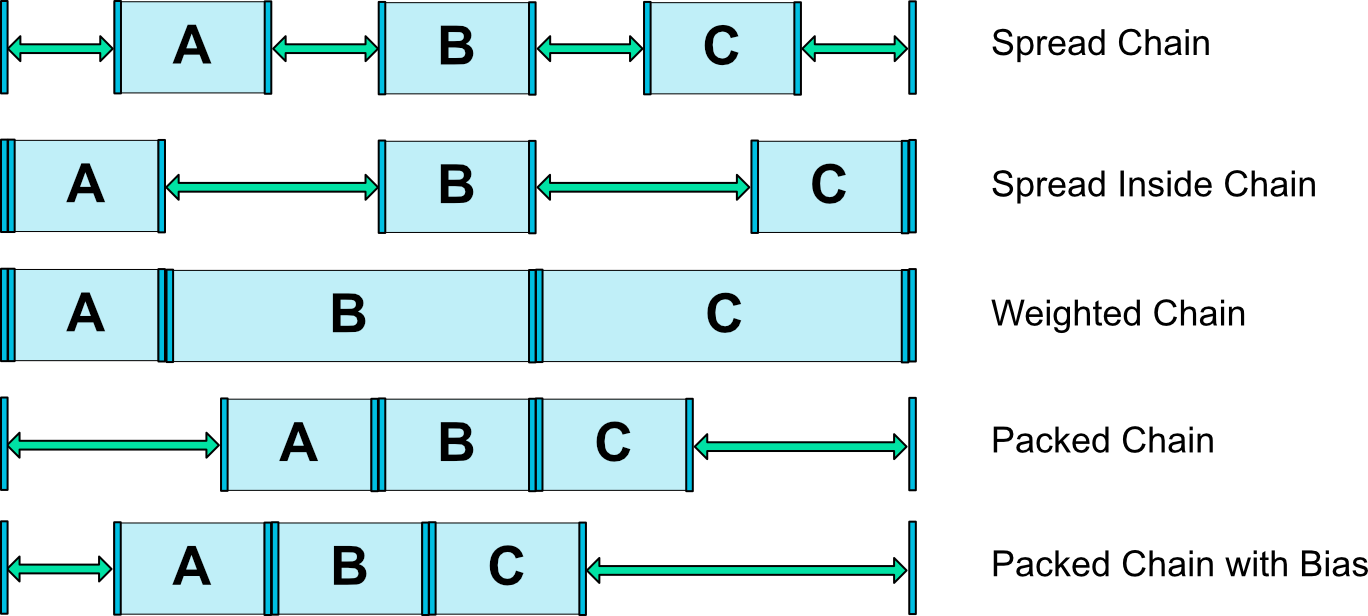
chainStyle 可以采用以下几种样式之一:
- Spread:视图是均匀分布的(在考虑外边距之后),这也是默认的样式。
- Spread inside:第一个和最后一个视图固定在链两端的约束边界上,其余视图均匀分布。
- Weighted:当链设置为 spread 或 spread inside 时,您可以通过将一个或多个视图设置为“match constraints”(
0dp) 来填充剩余空间。默认情况下,设置为“match constraints”的每个视图之间的空间均匀分布,但您可以使用layout_constraintHorizontal_weight和layout_constraintVertical_weight属性为每个视图分配重要性权重。如果您熟悉线性布局 (opens new window)中的layout_weight的话,就会知道该样式与它的原理是相同的。因此,权重值最高的视图获得的空间最大;相同权重的视图获得同样大小的空间。 - Packed:视图打包在一起(在考虑外边距之后), 然后,您可以通过更改链的头视图偏差调整整条链的偏差(左/右或上/下)。
示例:
xml布局:
<?xml version="1.0" encoding="utf-8"?>
<androidx.constraintlayout.widget.ConstraintLayout xmlns:android="http://schemas.android.com/apk/res/android"
    xmlns:app="http://schemas.android.com/apk/res-auto"
    android:layout_width="match_parent"
    android:layout_height="match_parent"
    android:background="#787373"
    android:paddingTop="10dp">

    <!-- 1. spread style chain -->
    <TextView
        android:id="@+id/tv1"
        android:layout_width="wrap_content"
        android:layout_height="wrap_content"
        android:text="Text1"
        android:background="#03A9F4"
        app:layout_constraintHorizontal_chainStyle="spread"
        app:layout_constraintTop_toTopOf="parent"
        app:layout_constraintLeft_toLeftOf="parent"
        app:layout_constraintRight_toLeftOf="@+id/tv2" />

    <TextView
        android:id="@+id/tv2"
        android:layout_width="wrap_content"
        android:layout_height="wrap_content"
        android:text="Text2"
        android:background="#FF9800"
        app:layout_constraintTop_toTopOf="parent"
        app:layout_constraintLeft_toRightOf="@+id/tv1"
        app:layout_constraintRight_toLeftOf="@+id/tv3" />

    <TextView
        android:id="@+id/tv3"
        android:layout_width="wrap_content"
        android:layout_height="wrap_content"
        android:text="Text3"
        android:background="#4CAF50"
        app:layout_constraintTop_toTopOf="parent"
        app:layout_constraintLeft_toRightOf="@+id/tv2"
        app:layout_constraintRight_toRightOf="parent" />

    <!-- 2. spread_inside style chain -->
    <TextView
        android:id="@+id/tv4"
        android:layout_width="wrap_content"
        android:layout_height="wrap_content"
        android:layout_marginTop="100dp"
        android:text="Text4"
        android:background="#03A9F4"
        app:layout_constraintHorizontal_chainStyle="spread_inside"
        app:layout_constraintTop_toTopOf="parent"
        app:layout_constraintLeft_toLeftOf="parent"
        app:layout_constraintRight_toLeftOf="@+id/tv5" />

    <TextView
        android:id="@+id/tv5"
        android:layout_width="wrap_content"
        android:layout_height="wrap_content"
        android:layout_marginTop="100dp"
        android:text="Text5"
        android:background="#FF9800"
        app:layout_constraintTop_toTopOf="parent"
        app:layout_constraintLeft_toRightOf="@+id/tv4"
        app:layout_constraintRight_toLeftOf="@+id/tv6" />

    <TextView
        android:id="@+id/tv6"
        android:layout_width="wrap_content"
        android:layout_height="wrap_content"
        android:layout_marginTop="100dp"
        android:text="Text6"
        android:background="#4CAF50"
        app:layout_constraintTop_toTopOf="parent"
        app:layout_constraintLeft_toRightOf="@+id/tv5"
        app:layout_constraintRight_toRightOf="parent" />

    <!-- 3. weighted chain -->
    <TextView
        android:id="@+id/tv7"
        android:layout_width="0dp"
        android:layout_height="wrap_content"
        android:layout_marginTop="200dp"
        android:text="Text7"
        android:background="#03A9F4"
        app:layout_constraintHorizontal_weight="1"
        app:layout_constraintTop_toTopOf="parent"
        app:layout_constraintLeft_toLeftOf="parent"
        app:layout_constraintRight_toLeftOf="@+id/tv5" />

    <TextView
        android:id="@+id/tv8"
        android:layout_width="0dp"
        android:layout_height="wrap_content"
        android:layout_marginTop="200dp"
        android:text="Text8"
        android:background="#FF9800"
        app:layout_constraintHorizontal_weight="2"
        app:layout_constraintTop_toTopOf="parent"
        app:layout_constraintLeft_toRightOf="@+id/tv7"
        app:layout_constraintRight_toLeftOf="@+id/tv9" />

    <TextView
        android:id="@+id/tv9"
        android:layout_width="0dp"
        android:layout_height="wrap_content"
        android:layout_marginTop="200dp"
        android:text="Text9"
        android:background="#4CAF50"
        app:layout_constraintHorizontal_weight="3"
        app:layout_constraintTop_toTopOf="parent"
        app:layout_constraintLeft_toRightOf="@+id/tv8"
        app:layout_constraintRight_toRightOf="parent" />

    <!-- 4. packed style chain -->
    <TextView
        android:id="@+id/tv10"
        android:layout_width="wrap_content"
        android:layout_height="wrap_content"
        android:layout_marginTop="300dp"
        android:text="Text10"
        android:background="#03A9F4"
        app:layout_constraintHorizontal_chainStyle="packed"
        app:layout_constraintTop_toTopOf="parent"
        app:layout_constraintLeft_toLeftOf="parent"
        app:layout_constraintRight_toLeftOf="@+id/tv11" />

    <TextView
        android:id="@+id/tv11"
        android:layout_width="wrap_content"
        android:layout_height="wrap_content"
        android:layout_marginTop="300dp"
        android:text="Text11"
        android:background="#FF9800"
        app:layout_constraintHorizontal_chainStyle="packed"
        app:layout_constraintTop_toTopOf="parent"
        app:layout_constraintLeft_toRightOf="@+id/tv10"
        app:layout_constraintRight_toLeftOf="@+id/tv12" />

    <TextView
        android:id="@+id/tv12"
        android:layout_width="wrap_content"
        android:layout_height="wrap_content"
        android:layout_marginTop="300dp"
        android:text="Text12"
        android:background="#4CAF50"
        app:layout_constraintTop_toTopOf="parent"
        app:layout_constraintLeft_toRightOf="@+id/tv11"
        app:layout_constraintRight_toRightOf="parent" />

    <!-- 5. packed style chain with bias -->
    <TextView
        android:id="@+id/tv13"
        android:layout_width="wrap_content"
        android:layout_height="wrap_content"
        android:layout_marginTop="400dp"
        android:text="Text13"
        android:background="#03A9F4"
        app:layout_constraintHorizontal_bias="0.3"
        app:layout_constraintHorizontal_chainStyle="packed"
        app:layout_constraintTop_toTopOf="parent"
        app:layout_constraintLeft_toLeftOf="parent"
        app:layout_constraintRight_toLeftOf="@+id/tv14" />

    <TextView
        android:id="@+id/tv14"
        android:layout_width="wrap_content"
        android:layout_height="wrap_content"
        android:layout_marginTop="400dp"
        android:text="Text14"
        android:background="#FF9800"
        app:layout_constraintHorizontal_chainStyle="packed"
        app:layout_constraintTop_toTopOf="parent"
        app:layout_constraintLeft_toRightOf="@+id/tv13"
        app:layout_constraintRight_toLeftOf="@+id/tv15" />

    <TextView
        android:id="@+id/tv15"
        android:layout_width="wrap_content"
        android:layout_height="wrap_content"
        android:layout_marginTop="400dp"
        android:text="Text15"
        android:background="#4CAF50"
        app:layout_constraintTop_toTopOf="parent"
        app:layout_constraintLeft_toRightOf="@+id/tv14"
        app:layout_constraintRight_toRightOf="parent" />

</androidx.constraintlayout.widget.ConstraintLayout>
效果:
提示:
当对链中的元素使用边距时,边距是可加的。例如,在水平链上,如果一个元素定义的右边距为10dp,而下一个元素定义的左边距为5dp,那么这两个元素之间的结果边距为15dp。
# 辅助工具
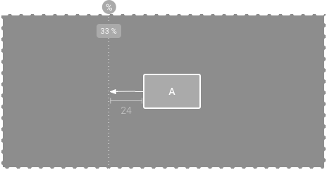
# 1. Guideline
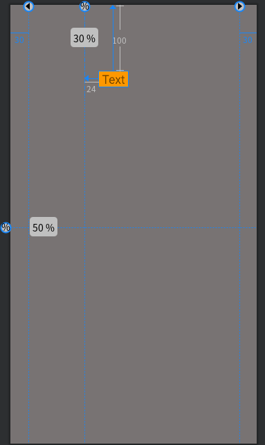
Guildline 引导线约束,您可以添加垂直或水平的引导线来约束视图,并且用户看不到该引导线。可以根据相对于布局边缘的 dp 单位或百分比在布局中定位引导线。
Guildline的主要属性:orientation:垂直vertical,水平horizontallayout_constraintGuide_begin:开始位置layout_constraintGuide_end:结束位置layout_constraintGuide_percent:距离顶部的百分比(orientation = horizontal 时则为距离左边)
示例:
xml布局:
<?xml version="1.0" encoding="utf-8"?>
<androidx.constraintlayout.widget.ConstraintLayout xmlns:android="http://schemas.android.com/apk/res/android"
    xmlns:app="http://schemas.android.com/apk/res-auto"
    android:layout_width="match_parent"
    android:layout_height="match_parent"
    android:background="#787373"
    android:paddingTop="10dp">

    <androidx.constraintlayout.widget.Guideline
        android:id="@+id/gl1"
        android:layout_width="wrap_content"
        android:layout_height="wrap_content"
        android:orientation="vertical"
        app:layout_constraintGuide_begin="30dp" />

    <androidx.constraintlayout.widget.Guideline
        android:id="@+id/gl2"
        android:layout_width="wrap_content"
        android:layout_height="wrap_content"
        android:orientation="vertical"
        app:layout_constraintGuide_end="30dp" />

    <androidx.constraintlayout.widget.Guideline
        android:id="@+id/gl3"
        android:layout_width="wrap_content"
        android:layout_height="wrap_content"
        android:orientation="vertical"
        app:layout_constraintGuide_percent="0.3" />

    <androidx.constraintlayout.widget.Guideline
        android:id="@+id/gl4"
        android:layout_width="wrap_content"
        android:layout_height="wrap_content"
        android:orientation="horizontal"
        app:layout_constraintGuide_percent="0.5" />

    <!-- 布局参考Guideline:gl3 -->
    <TextView
        android:layout_width="50dp"
        android:layout_height="wrap_content"
        android:layout_marginLeft="24dp"
        android:layout_marginTop="100dp"
        android:background="#FF9800"
        android:gravity="center"
        android:text="Text"
        android:textSize="20sp"
        app:layout_constraintLeft_toLeftOf="@id/gl3"
        app:layout_constraintTop_toTopOf="parent" />

</androidx.constraintlayout.widget.ConstraintLayout>
效果:
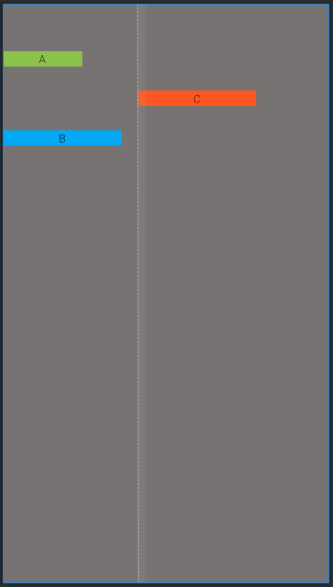
# 2. Barrier
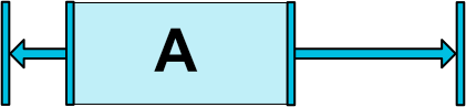
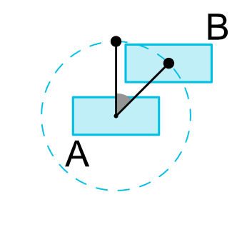
Barrier 屏障约束,与引导线类似,屏障是一条隐藏的线,您可以用它来约束视图。屏障不会定义自己的位置;相反,屏障的位置会随着其中所含视图的位置而移动。如果您希望将视图限制到一组视图而不是某个特定视图,这就非常有用。
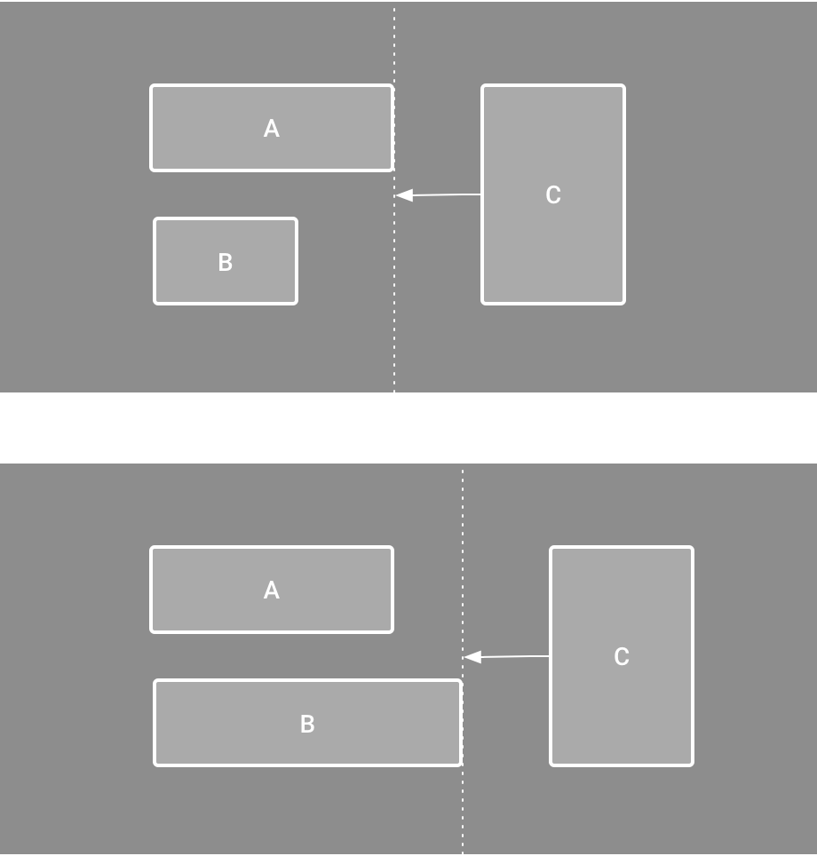
如上图所示,如果 C 需要在 A 和 B 的右侧,但是 A 和 B 的宽度大小不是固定的,这个时候就可以使用屏障约束来实现了,Barrier可以在多个控件的一侧建立一个屏障约束。
Barrier 的常用属性:
barrierDirection:屏障所在的位置,可设置的值有:bottom、end、left、right、start、topconstraint_referenced_ids:屏障引用的控件,可设置多个(用“,”隔开)barrierAllowsGoneWidgets:允许引用的组件的 visibility 属性是 gone 状态barrierMargin:屏障的所在位置的边距大小
示例:
xml布局:
<androidx.constraintlayout.widget.ConstraintLayout xmlns:android="http://schemas.android.com/apk/res/android"
    xmlns:app="http://schemas.android.com/apk/res-auto"
    android:layout_width="match_parent"
    android:layout_height="match_parent"
    android:background="#787373"
    android:paddingTop="10dp">

    <TextView
        android:id="@+id/tv_a"
        android:layout_width="100dp"
        android:layout_height="wrap_content"
        android:layout_marginTop="50dp"
        android:background="#8BC34A"
        android:gravity="center"
        android:text="A"
        app:layout_constraintLeft_toLeftOf="parent"
        app:layout_constraintTop_toTopOf="parent" />

    <TextView
        android:id="@+id/tv_b"
        android:layout_width="150dp"
        android:layout_height="wrap_content"
        android:layout_marginTop="150dp"
        android:background="#03A9F4"
        android:gravity="center"
        android:text="B"
        app:layout_constraintLeft_toLeftOf="parent"
        app:layout_constraintTop_toTopOf="parent" />

    <!-- 在组件A和B的右侧实现一个屏障 -->
    <androidx.constraintlayout.widget.Barrier
        android:id="@+id/barr_ab_right"
        android:layout_width="wrap_content"
        android:layout_height="wrap_content"
        app:barrierDirection="right"
        app:barrierAllowsGoneWidgets="true"
        app:barrierMargin="20dp"
        app:constraint_referenced_ids="tv_a,tv_b" />

    <TextView
        android:id="@+id/tv_c"
        android:layout_width="150dp"
        android:layout_height="wrap_content"
        android:layout_marginTop="100dp"
        android:background="#FF5722"
        android:gravity="center"
        android:text="C"
        app:layout_constraintLeft_toLeftOf="@id/barr_ab_right"
        app:layout_constraintTop_toTopOf="parent" />

</androidx.constraintlayout.widget.ConstraintLayout>
效果:
# 3. Group
Group 可以把多个控件归为一组,方便统一控制这一组控件。
常用的属性:
constraint_referenced_ids:引用的控件组id,可设置多个(用“,”隔开)
示例:
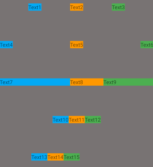
有 6 个两列并排的组件,用 Group 把组件 4 和组件 6 归为一组,再设置这组控件的可见性为 invisible,此时组件 4 和组件 6 都将不可见。
xml布局:
<?xml version="1.0" encoding="utf-8"?>
<androidx.constraintlayout.widget.ConstraintLayout xmlns:android="http://schemas.android.com/apk/res/android"
    xmlns:app="http://schemas.android.com/apk/res-auto"
    android:layout_width="match_parent"
    android:layout_height="match_parent"
    android:background="#787373"
    android:paddingTop="10dp">

    <TextView
        android:id="@+id/tv1"
        android:layout_width="wrap_content"
        android:layout_height="wrap_content"
        android:text="Text1"
        android:background="#03A9F4"
        app:layout_constraintHorizontal_chainStyle="spread"
        app:layout_constraintTop_toTopOf="parent"
        app:layout_constraintLeft_toLeftOf="parent"
        app:layout_constraintRight_toLeftOf="@+id/tv2" />

    <TextView
        android:id="@+id/tv2"
        android:layout_width="wrap_content"
        android:layout_height="wrap_content"
        android:text="Text2"
        android:background="#FF9800"
        app:layout_constraintTop_toTopOf="parent"
        app:layout_constraintLeft_toRightOf="@+id/tv1"
        app:layout_constraintRight_toLeftOf="@+id/tv3" />

    <TextView
        android:id="@+id/tv3"
        android:layout_width="wrap_content"
        android:layout_height="wrap_content"
        android:text="Text3"
        android:background="#4CAF50"
        app:layout_constraintTop_toTopOf="parent"
        app:layout_constraintLeft_toRightOf="@+id/tv2"
        app:layout_constraintRight_toRightOf="parent" />

    <TextView
        android:id="@+id/tv4"
        android:layout_width="wrap_content"
        android:layout_height="wrap_content"
        android:layout_marginTop="100dp"
        android:text="Text4"
        android:background="#03A9F4"
        app:layout_constraintTop_toTopOf="parent"
        app:layout_constraintLeft_toLeftOf="parent"
        app:layout_constraintRight_toLeftOf="@+id/tv5" />

    <TextView
        android:id="@+id/tv5"
        android:layout_width="wrap_content"
        android:layout_height="wrap_content"
        android:layout_marginTop="100dp"
        android:text="Text5"
        android:background="#FF9800"
        app:layout_constraintTop_toTopOf="parent"
        app:layout_constraintLeft_toRightOf="@+id/tv4"
        app:layout_constraintRight_toLeftOf="@+id/tv6" />

    <TextView
        android:id="@+id/tv6"
        android:layout_width="wrap_content"
        android:layout_height="wrap_content"
        android:layout_marginTop="100dp"
        android:text="Text6"
        android:background="#4CAF50"
        app:layout_constraintTop_toTopOf="parent"
        app:layout_constraintLeft_toRightOf="@+id/tv5"
        app:layout_constraintRight_toRightOf="parent" />

    <!-- 将组件4,6归为一组,并控制组不可见 -->
    <androidx.constraintlayout.widget.Group
        android:layout_width="wrap_content"
        android:layout_height="wrap_content"
        app:constraint_referenced_ids="tv4,tv6"
        android:visibility="invisible" />

</androidx.constraintlayout.widget.ConstraintLayout>
效果:
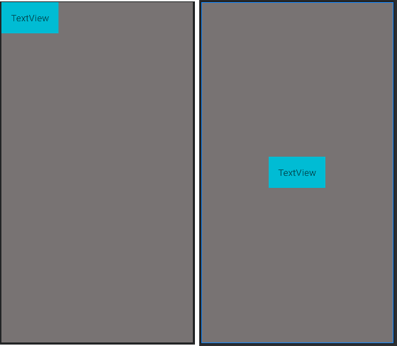
# 4. Placeholder
Placeholder 指的是占位符。一个View占位符,当指定一个 Placeholder 的 content属性为另一个 view 的 id 时,该 view 本身就会被 gone 掉,然后装载到 Placeholder 的位置。相当于把一个 View 当前位置移动到另外指定的位置。
注意:
目前测试下来,目标 View 和 Placeholder 的宽和高必须是 wrap_content 才有效果,否则的话可能显示有问题,或者显示不出来,所以此项功能暂时不推荐使用,局限性比较大。
示例:
xml布局:
<?xml version="1.0" encoding="utf-8"?>
<androidx.constraintlayout.widget.ConstraintLayout xmlns:android="http://schemas.android.com/apk/res/android"
    xmlns:app="http://schemas.android.com/apk/res-auto"
    android:layout_width="match_parent"
    android:layout_height="match_parent"
    android:background="#787373">

    <!-- 占位符位于屏幕中心 -->
    <androidx.constraintlayout.widget.Placeholder
        android:id="@+id/placeholder"
        android:layout_width="wrap_content"
        android:layout_height="wrap_content"
        app:content="@+id/tv"
        app:layout_constraintLeft_toLeftOf="parent"
        app:layout_constraintRight_toRightOf="parent"
        app:layout_constraintBottom_toBottomOf="parent"
        app:layout_constraintTop_toTopOf="parent" />

    <!-- 目标组件位于左上角 -->
    <TextView
        android:id="@+id/tv"
        android:layout_width="wrap_content"
        android:layout_height="wrap_content"
        android:padding="20dp"
        android:text="TextView"
        android:textSize="20sp"
        android:gravity="center"
        android:background="#00BCD4"
        app:layout_constraintTop_toTopOf="parent"
        app:layout_constraintLeft_toLeftOf="parent" />

</androidx.constraintlayout.widget.ConstraintLayout>
效果:
# 5. Optimizer
当使用 MATCH_CONSTRAINT(0dp) 约束时,ConstraintLayout 将对控件进行 2 次测量,ConstraintLayout在1.1中可以通过设置 layout_optimizationLevel 决定控件在哪方面进行优化,可设置的值有:
none:无优化standard:仅优化直接约束和屏障约束(默认)direct:优化直接约束barrier:优化屏障约束chain:优化链约束dimensions:优化尺寸测量
# 小结
本章主要介绍了 ConstraintLayout 的基本语法和使用方式,一些辅助布局工具的使用,ConstraintLayout可以在 Android Studio 的可视化视图工具中,只需要托拉拽就可以完成整个布局,这里就不在介绍了,有需求的可以查看 官方可视化工具的使用 (opens new window),这里还是推荐大家使用代码的方式来精准布局,这样的话组件之间的关系是便于维护的。