ProgressBar进度条,表示操作进度的控件。
进度条的应用场景有很多,在一些耗时操作情况下如果没有响应的操作提示,那么用户会认为操作无响应或者卡住了的体验,这样会带来很不好的用户体验。所以在进行耗时操作的情况下使用进度条来让用户感知到操作在执行过程中,如果可以的话还可以使用进度条直观的告知任务执行的进度,用户体验会得到很大的提升。
# 进度条类型
系统默认提供了两种类型的进度条方式:
不确定进度类型:无具体进度显示,当不知道一个操作需要多长时间时,可以使用不确定模式类型的进度条。不确定进度模式是默认类型的进度条,并显示一个循环动画,没有特定数量的进度指示。
确定进度类型:有具体进度显示,当想要显示已发生的特定数量的进度时,请使用确定进度模式的进度条。例如,正在检索的文件的剩余百分比,批处理中写入数据库的记录量,或正在播放的音频文件的剩余百分比。要指示确定的进度,需要将进度条的样式设置为 R.style.Widget ProgressBar Horizontal (opens new window),然后设置对应进度android:progress属性的具体数值。
系统提供的进度条样式:
Widget.ProgressBar.Horizontal:水平进度样式Widget.ProgressBar.Small:小圆形进度样式Widget.ProgressBar:中圆形进度样式(默认样式,可省略)Widget.ProgressBar.Large:大圆形进度样式Widget.ProgressBar.Small.Inverse:Inverse小圆形进度样式Widget.ProgressBar.Inverse:Inverse中圆形进度样式Widget.ProgressBar.Large.Inverse:Inverse大圆形进度样式
小知识:
“Inverse” 类型样式与标准的样式差异,官方的解释如下:
The "inverse" styles provide an inverse color scheme for the spinner, which may be necessary if your application uses a light colored theme (a white background).
翻译:Inverse 样式为旋转器提供了反颜色方案,如果应用程序使用浅色主题(白色背景),这可能是必要的。
查看样式定义的源文件可以看到,其实就是Inverse类型的样式中,定义的indeterminateDrawable属性资源不一样,Inverse类型的资源是 spinner_black_76, 否则是 spinner_white_76 。也就是说,在白色背景情况下,使用Inverse类型显示效果会更友好。
# 常用属性
android:max:进度条的进度最大值,默认值100android:min:进度条的进度最小值,默认值0android:progress:进度条当前进度值android:progressDrawable:设置进度轨道对应的Drawable对象android:indeterminate:是否是不精确显示进度android:indeterminateDrawable:设置不显示进度的进度条的Drawable对象android:indeterminateDuration:设置不精确显示进度的持续时间android:secondaryProgress:二级进度值,默认值0,类似于视频播放的一条是当前播放进度,一条是缓冲进度
提示:相关属性在Java代码中也有进行相应的设置和获取值方法。
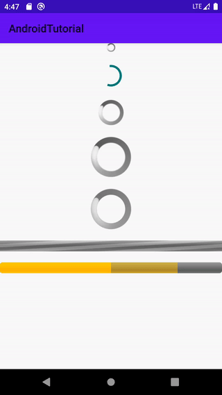
# 系统默认进度条示例
xml代码:
<?xml version="1.0" encoding="utf-8"?>
<LinearLayout xmlns:android="http://schemas.android.com/apk/res/android"
    android:layout_width="match_parent"
    android:layout_height="match_parent"
    android:gravity="center_horizontal"
    android:orientation="vertical">

    <!-- 系统不确定类型进度条:小 -->
    <ProgressBar
        style="@android:style/Widget.ProgressBar.Small"
        android:layout_width="wrap_content"
        android:layout_height="wrap_content" />

    <!-- 系统不确定类型进度条:中(默认),当前应用主题的显示风格 -->
    <ProgressBar
        android:layout_width="wrap_content"
        android:layout_height="wrap_content"
        android:layout_marginTop="20dp" />

    <!-- 系统不确定类型进度条:中(默认),系统默认显示风格 -->
    <ProgressBar
        style="@android:style/Widget.ProgressBar"
        android:layout_width="wrap_content"
        android:layout_height="wrap_content"
        android:layout_marginTop="20dp" />

    <!-- 系统不确定类型进度条:大 -->
    <ProgressBar
        style="@android:style/Widget.ProgressBar.Large"
        android:layout_width="wrap_content"
        android:layout_height="wrap_content"
        android:layout_marginTop="20dp" />

    <!-- 系统不确定类型进度条:大,Inverse类型(进度条的显示颜色效果有细微区别) -->
    <ProgressBar
        style="@android:style/Widget.ProgressBar.Large.Inverse"
        android:layout_width="wrap_content"
        android:layout_height="wrap_content"
        android:layout_marginTop="20dp" />

    <!-- 系统不确定类型水平进度条: -->
    <ProgressBar
        style="@android:style/Widget.ProgressBar.Horizontal"
        android:layout_width="match_parent"
        android:layout_height="wrap_content"
        android:layout_marginTop="20dp"
        android:indeterminate="true" />

    <!-- 系统确定类型水平进度条:当前进度50、二级进度80、最大进度100、最小值0 -->
    <ProgressBar
        style="@android:style/Widget.ProgressBar.Horizontal"
        android:layout_width="match_parent"
        android:layout_height="wrap_content"
        android:layout_marginTop="20dp"
        android:max="100"
        android:min="0"
        android:progress="50"
        android:secondaryProgress="80" />

</LinearLayout>
效果:
# 自定义进度样式
系统默认的进度条的样式是满足不了各种产品的 UI 设计的,所以就需要自定义样式的进度条,自定义样式进度条方式有很多,一般主要有两种,一种是自定义进度条的相关 drawable 资源来实现,还有一种是自定义 View 绘制的方式实现。
在这里我们主要进行前者自定义指定 drawable 资源方式实现,自定义 View 实现方式在后续会有相关详细的介绍。
# 不确定进度样式
在 drawable 文件夹中新建 drawable 类型资源文件自定义 drawable 样式,一般有两种实现方式,一种是自定义 drawable shape 样式资源,还有一种是drawable中引用其他图片(img)资源,接下来就来一起简单实现下这两种实现方式。
- 自定义 drawable shape 圆形样式进度
shape_progress_spinner.xml: 圆形形状
<?xml version="1.0" encoding="utf-8"?>
<!-- 自定义进度圆形形状 -->
<shape xmlns:android="http://schemas.android.com/apk/res/android"
    android:shape="oval"> <!-- 圆形 -->
    <!-- 渐变色,90°方向 -->
    <gradient
        android:startColor="#2196F3"
        android:endColor="#FF5722"
        android:angle="90" />
    <!-- 描边 -->
    <stroke android:width="4dp" android:color="#4CAF50" />
</shape>
anim_progress_rotate.xml: 指定形状资源,动画类型以及相关动画参数
<?xml version="1.0" encoding="utf-8"?>
<!-- 定义旋转圆形动画样式,指定形状资源和旋转中心位置 -->
<animated-rotate xmlns:android="http://schemas.android.com/apk/res/android"
    android:drawable="@drawable/shape_progress_spinner"
    android:pivotX="50%"
    android:pivotY="50%" />
- 自定义 drawable 图片圆形样式进度
图片资源:

anim_progress_img.xml: 指定图片资源,动画类型以及相关动画参数
<?xml version="1.0" encoding="utf-8"?>
<!-- 定义旋转动画样式,指定显示的图片资源和旋转中心位置 -->
<animated-rotate xmlns:android="http://schemas.android.com/apk/res/android"
    android:drawable="@drawable/loading"
    android:pivotX="50%"
    android:pivotY="50%" />
- 自定义 drawable shape 水平样式矩形进度
shap_progress_1.xml: 矩形样式,第一种配色
<?xml version="1.0" encoding="utf-8"?>
<!-- 矩形形状 -->
<shape xmlns:android="http://schemas.android.com/apk/res/android"
    android:shape="rectangle"> <!-- 矩形 -->
    <!-- 渐变色定义 -->
    <gradient
        android:angle="0"
        android:startColor="#FFEB3B"
        android:centerColor="#2196F3"
        android:endColor="#F44336" />
</shape>
shap_progress_2.xml: 矩形样式,第二种配色
<?xml version="1.0" encoding="utf-8"?>
<!-- 矩形形状 -->
<shape xmlns:android="http://schemas.android.com/apk/res/android"
    android:shape="rectangle"> <!-- 矩形 -->
    <!-- 渐变色定义 -->
    <gradient
        android:angle="0"
        android:startColor="#2196F3"
        android:centerColor="#FFEB3B"
        android:endColor="#F44336" />
</shape>
shap_progress_3.xml: 矩形样式,第三种配色
<?xml version="1.0" encoding="utf-8"?>
<!-- 矩形形状 -->
<shape xmlns:android="http://schemas.android.com/apk/res/android"
    android:shape="rectangle"> <!-- 矩形 -->
    <!-- 渐变色定义 -->
    <gradient
        android:angle="0"
        android:startColor="#F44336"
        android:centerColor="#FFEB3B"
        android:endColor="#2196F3" />
</shape>
anim_progress_list.xml: 指定水平方向矩形样式序列帧类型动画,定义播放每一帧动画资源以及播放时长
<?xml version="1.0" encoding="utf-8"?>
<!-- 定义序列帧动画的每一帧资源和时长 -->
<animation-list xmlns:android="http://schemas.android.com/apk/res/android">
    <item android:drawable="@drawable/shap_progress_1" android:duration="200" />
    <item android:drawable="@drawable/shap_progress_2" android:duration="200" />
    <item android:drawable="@drawable/shap_progress_3" android:duration="200" />
</animation-list>
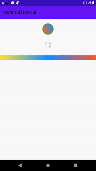
# 不确定进度样式示例
xml布局:
<?xml version="1.0" encoding="utf-8"?>
<LinearLayout xmlns:android="http://schemas.android.com/apk/res/android"
    android:layout_width="match_parent"
    android:layout_height="match_parent"
    android:gravity="center_horizontal"
    android:orientation="vertical">

    <!-- 不确定进度:自定义drawable样式资源 -->
    <ProgressBar
        android:id="@+id/pb_demo1"
        android:layout_width="wrap_content"
        android:layout_height="wrap_content"
        android:layout_marginTop="20dp"
        android:indeterminateDrawable="@drawable/anim_progress_rotate" />

    <!-- 不确定进度:自定义图片样式资源 -->
    <ProgressBar
        android:id="@+id/pb_demo2"
        android:layout_width="wrap_content"
        android:layout_height="wrap_content"
        android:layout_marginTop="20dp"
        android:indeterminateDrawable="@drawable/anim_progress_img" />

    <!-- 不确定进度:水平样式,自定义drawable样式资源 -->
    <ProgressBar
        android:id="@+id/pb_demo3"
        style="@android:style/Widget.ProgressBar.Horizontal"
        android:layout_width="match_parent"
        android:layout_height="wrap_content"
        android:layout_marginTop="20dp"
        android:indeterminate="true"
        android:indeterminateDrawable="@drawable/anim_progress_list"
        android:max="100"
        android:min="0"
        android:progress="50" />

</LinearLayout>
效果图:
# 确定进度样式
确定进度样式可以自定义进度条的背景、二级进度、一级进度资源来实现个性化样式,在这里就简单实现下,了解自定义的原理和方式,想要好看的效果还是需要专业的 UI 人员来设计配色方案的。
自定义一个层级的 drawable 资源文件,并指定其对应资源的特定 id :
progress_determinate_bg.xml: 定义进度条的三层显示的样式
<?xml version="1.0" encoding="utf-8"?>
<layer-list xmlns:android="http://schemas.android.com/apk/res/android">

    <!-- 3层的顺序即为显示时的叠加层级 -->
    <!-- 第一层:背景资源,必须指定此id来区分:@android:id/background -->
    <item android:id="@android:id/background">
        <shape>
            <corners android:radius="5dip" />

            <solid android:color="#CCCCCC" />
        </shape>
    </item>

    <!-- 第二层:二级进度条的资源, 必须指定此id来区分:@android:id/secondaryProgress -->
    <item android:id="@android:id/secondaryProgress">
        <clip>
            <shape>
                <corners android:radius="5dip" />
                <solid android:color="#99FF9800" />
            </shape>
        </clip>
    </item>

    <!-- 第三层:一级进度条的颜色,也可以直接替换成图片,必须指定此id来区分:@android:id/progress -->
    <item android:id="@android:id/progress">
        <clip>
            <shape>
                <corners android:radius="5dip" />
                <!-- 单色填充 -->
                <!--<solid android:color="#8BC34A" />-->
                <!-- 渐变色填充 -->
                <gradient
                    android:angle="0"
                    android:startColor="#EFECEC"
                    android:centerColor="#8BC34A"
                    android:endColor="#4CAF50" />
            </shape>
        </clip>
    </item>

</layer-list>
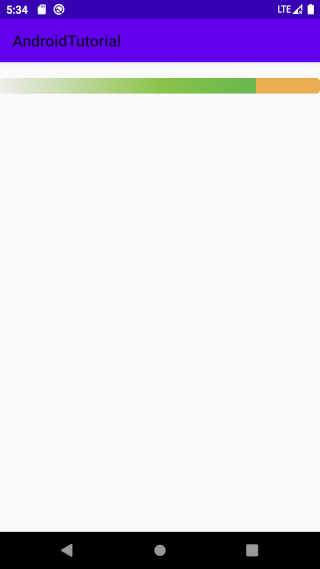
# 确定进度样式示例
xml布局:
<?xml version="1.0" encoding="utf-8"?>
<LinearLayout xmlns:android="http://schemas.android.com/apk/res/android"
    android:layout_width="match_parent"
    android:layout_height="match_parent"
    android:gravity="center_horizontal"
    android:orientation="vertical">

    <!-- 自定义系统确定类型水平样式进度条:当前进度80、二级进度100、最大进度100、最小值0 -->
    <ProgressBar
        style="@android:style/Widget.ProgressBar.Horizontal"
        android:layout_width="match_parent"
        android:layout_height="wrap_content"
        android:layout_marginTop="20dp"
        android:max="100"
        android:min="0"
        android:progress="80"
        android:progressDrawable="@drawable/progress_determinate_bg"
        android:secondaryProgress="100" />

</LinearLayout>
效果:
# 结束
本节介绍了进度条控件的常用属性和相关使用方法,并实现了自定义进度条样式。更多进度条的属性和用法请参考:ProgressBar (opens new window)。